Enter password to view case study
Product Design
/
b2b
/
AI
Aurora
Building trust in a AI-native platform across a multi-stakeholder ecosystem
Overview
As the sole product designer and first design hire, I led product design from 0 -> 1 at Aurora, building a multi-sided AI native platform for multiple stakeholders. I owned UX strategy, ran majority, if not all user interviews, built the design system from scratch, and shipped every screen.
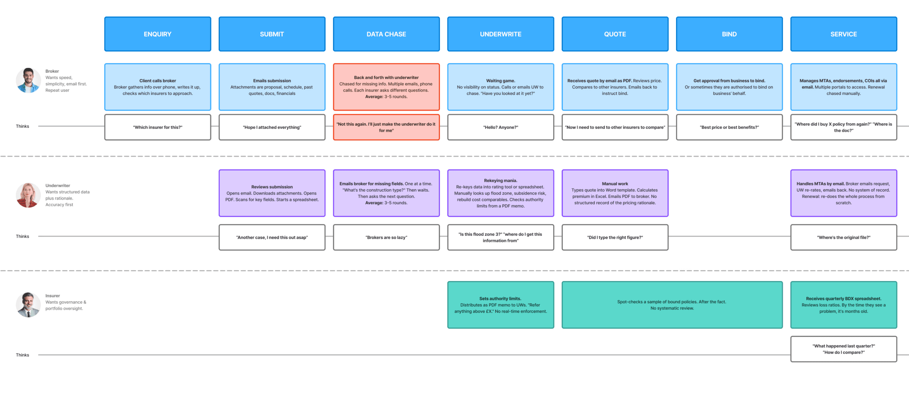
The platform replaces a manual underwriting chain (email, re-keying, spreadsheets, weeks of delay) with an AI-powered pipeline: intake, extraction, enrichment, underwriting, quoting, binding. The hard part was not the automation. It was designing one system that serves three stakeholders with fundamentally different needs from the same data.
The outcome: £221k → £1.72M GWP. Enquiries from 76 at launch to 259/month. Conversion from 18% to 37%. The AI handles 70% of cases with zero human intervention.
Year
2024 – Current
Company
Aurora
Role
Lead Product Designer
Scope
0 - 1
UX Strategy & Research
Design System creation,
Interaction design
Prototyping
What was the impact?
GWP growth
£221k → £1.72M
Enquiry volume
76 → 259/month
Quote rate
75 → 81%
STP rate
52% - 70% of quotes fully automated
conversion
18 → 37% enquiry to bind
fundraising
The problem
Every day a decision sits unfinished is revenue that walks to a competitor.
We interviewed 5 brokers and 5 underwriters, and 3 C-suite leaders to map the current process. The same failure pattern came up every time: unstructured inputs, manual re-keying, and no shared view of where anything stood.
Unstructured data everywhere
Data arrives as PDFs, spreadsheets, emails. Every handoff introduces friction, errors, and delay. No single source of truth.
No shared system
Every actor uses their own tools. Data is re-keyed at every handoff. One case might be typed into 3–4 different systems before it’s quoted.
Email as queue
The inbox is the work management system. Cases get lost in threads. No priority, no status, no SLA tracking.
Low transparency
Decisions live in emails. No structured record of why a case was priced, why a referral was approved, or what data the decision was based on. Compliance risk.


The target audience
Three users, one system
We understood that we were basically serving a multi-sided ecosystem. Each stakeholder has different goals, different risk tolerances, and a different definition of success.

The broker (intemediary)
wants speed and low friction. Submit in under five minutes. Quote back fast. No new tools.
What success looks like: Submit in under 5 minutes. Quote back fast.

The underwriter (expert operator)
wants structured data, fewer manual tasks, and clear rationale for every AI-assisted decision.
What success looks like: All evidence assembled. Review & price fast. Decision is defensible.

The insurer (business)
wants profitable growth, governance, and the ability to iterate on algorithmic rules and pricing quickly.
What success looks like: Real-time portfolio visibility. Zero authority breaches.
The initial assumption
We believed Brokers will use our product since we already have data enrichment and AI tooling available.
Discovery interviews told us brokers were the beginning of the funnel. If we designed for them, reduced their friction, made submission faster, gave them visibility, we would solve the monetisation problem downstream. Everything else (UW throughput, STP rate, GWP growth) followed from broker adoption.


the pivot
What we found
From our research we heard a lot of top frustrations like “Too many portals to remember.” “Logging in takes longer than the submission.” “I already have the info in my email.” “Different portal for every insurer.”
The features converted. The portal didn't. The access pattern was the real barrier to why we couldn't drive more submissions.
the new solution
Design a multi-sided platform where AI processes unstructured data, surfaces assessments for human review, and documents every decision with a full audit trail. All without asking any user to change how they already work.
The decision: Pivot from portal-first to email-first. Instead of asking users to change their behaviour, we designed a pipeline that transforms existing workflows into structured, auditable processes.
The portal still exists for power-user brokers with multiple submissions per policy, but email is the primary intake.
This pivot drove a 3.4× increase in submission volume (76 at launch of new model → 259/month) and doubled conversion (18% → 37%).

Our solution cutting down time to bind significantly
the solution
The broker experience
AI enriched email reply
As a broker, I want to submit cases without logging into another portal.
A broker sends an email as they always have. The AI reads the attachments, extracts structured data, identifies gaps, and sends back a smart reply.
Email-first intake drove a 3.4× increase in submission volume

Proactive follow up
After the launch we initially found a problem where the system was too efficient at following up with questions. It literally went line by line chasing. We discovered the friction through broker feedback and drop-off rates.
I solutionised this in 1 day by proposing an intervention where we enrich the submission before we went back to the broker with one structured message containing everything needed.
The consolidated follow-up improved quote rate from 75% to 81% by reducing cases stalling on missing data
Review over re-keying submission
As a broker, I want to review what the AI found rather than fill everything in manually.
We tested two approaches. 18/30 brokers preferred inline editing with AI pre-fill over a two-step review flow. One broker called the review flow "checking someone else's homework before doing my own."
The information is pre-populated. The human validates. Every field the broker does not have to manually enter is friction removed from the top of the funnel. This was directly tied to our conversion metric because the most common reason cases stalled was missing data, not risk complexity.
But while the portal still exists. It is not the front door.
A subset of brokers, typically those placing multiple submissions per policy or managing a book across several insurers, wanted direct access: upload documents, track case status, review what the AI extracted, edit fields themselves.
One broker at Howden told us she had twelve active cases at any given time and needed a single view across all of them. Email threads do not give you that.
As a power-user broker, I want to submit and track multiple cases without changing how I already work.
The portal exists only as a secondary channel for power users who want visibility and control. Both routes feed the same pipeline. A broker who submits by email on Monday can log into the portal on Tuesday and see the same case, same extracted data, same status
As a broker, I want to submit and track cases without changing how I already work.
I designed upload and correction points at every stage of the journey so a broker is never stuck waiting for a follow-up email to add a document they already have.
the solution
The underwriter experience
As an underwriter, I want an at-a-glance view of my queue, with helpful insights and what needs attention already surfaced.
Accuracy, traceability, decision authority. The dashboard shows queue, portfolio performance, and AI-generated intelligence. Every decision is documented with a full audit trail.
AI extraction with source tracing
As an underwriter, I want to see where the AI got its data before I act on it.
Underwriters told us early: "I will not trust a number I cannot trace."
Every AI-enriched field has a source tag. Click any pre-filled value to see the source document, the extraction location, the AI reasoning of how something is derived.
One system, role-based views


As a broker or underwriter, I want to see what's relevant to my role. not everything at once.
The broker sees status and what is needed. The underwriter sees risk signals, authority indicators, and a decision panel. Same case but different surfaces.
ux principles
Four principles I used to make fast decisions across the platform
From the research, I also created a set of UX principles anchored around human outcomes that were important to our users: reducing cognitive load, building trust in AI outputs, and keeping professionals in control.
recognition
over recall
Prefer suggestions, pre-filled answers, and templates over blank forms.
progressive
disclosure
Show the minimum to move forward. Reveal depth only when the user asks.
trust
calibration
For high-stakes steps, always show what we recommend, why, and what evidence supports it.
Automation without ambiguity
Auto-fill only when confidence is high. Otherwise, suggest and require confirmation.
The Aurora AI layer
From research, we knew expert users preferred intelligence that augmented their judgment, not replaced it. The biggest drag on funnel speed was not risk complexity but incomplete information. The design challenges were specific enough, and the trust implications nuanced enough, that the AI layer became its own body of work.
design system
Themable design system for a white-label platform.
Aurora had no design system, no component library, and no visual language when I joined. I established the visual direction, built a Figma component library (tokens, components, patterns), and documented it for the Aurora web experience.
The system itself had to be themable from the start, as it needed to facilitate onboarding multiple insurers who each need their own branded experience and we needed to move fast.
Instead of going down a route where we had to create components from scratch, I decided to go with the shadcn system. Then to ease the implementation burden, I used a simple JSON extractor → CSS pipeline where tokens could automatically be pushed to deployment easily, as our growth model depends on onboarding multiple insurers, and the design system had to make that operationally cheap.


Outcome
Broker new email submission and new UW platform launched to QBE & Howden.
£221k → £1.72M GWP run-rate in 5 months. A direct result of faster decision cycles and higher conversion.
52% straight-through processing rate at launch, now at 70%
18 → 37% enquiry to bind, maintained as volume scaled 5×.
In parallel, getting multiple insurer interest enquiries, with new product lines in onboarding
What I learned
Designing with users as stakeholders, not testers, creates buy-in faster than any demo. We designed alongside underwriters and brokers, not for them.
Governance features like audit trails, provenance, security, and role-based access were not overhead. They were why QBE approved the product.
Designing alone means actively building feedback loops or you'll ship in a vacuum.